tirsdag 6. desember 2011

Cubism 6/12/11 + Evaluation

During todays lesson I continued to use the soft pastels to color in my analytic piece. I think it was very successful, especially the football with all of its colors.

This is largely due as it gives a happy tone to the picture. For next time there are a few aspects i would like to change and this would be th graduation of the empty spaces. This is because it would make the picture more realistic and more 3D. On another hand I liked the variety of colors. I also liked the fact I used collage along with the soft pastels as it made more contrasts in the structure of the art work. The contours could also have been written in a neater way. The soccer shirt was messy and destroyed a little of the fluency in colors in the rest of the piece. But except for this, I think it was very good!

Other people also agreed about this and they said that the colors were good. Mirre was one person that really empathized this. People also commented that I should maybe not have the lines between the different parts of the drawing. I agree about this and this would be the major problem and the aspect I would change for next time.
This is the final synthetic artwork and I think it was very good! I liked this unit.

lørdag 3. desember 2011

Cubism 1/12/10

During this lesson I did a great deal of work. During the last week I had done my sketch at home and it included a football, as I like soccer. I also drew clouds as i am interested in the weather, and I thought it would go well with the football, it alone would have been a little boring. For homework I also prepared  to do my Carobon copy, so when I came to art class I could imediatly start with my final drawing. This was also what I did when I came to art class. When I was finished with copying the sketch onto the final one, I used a black marker to make the contours stand out.
This is my sketch that I carbon copied onto my final synthetic artwork.

This is my picture after it was carbon copied and the outlines (contours) were drawn with black. I chose to use a white background since it would allow the remaing colours to stand more out. 

When this was done I decided to get colours onto my drawing. I used soft pastels (not oily pastels) and this worked very well as I could get exactly the colour I wanted. This is pne of the major reasons why I believe my synthetic piece is going to be more succsesfull that my aalytic piece. I also decided the major background colours would be blue and green as they reflect the grass and the sky. Another aspect I liked about my drawing is that the colours are quite smooth and relaxing. This gives a nice touch to it.Under is my picture after the lesson. I am not finished, but with one more lesson I will probably become finished.

This is how far I have come with the picture. The ball is going to be multicoloured and allot of the remaining background will be green.

lørdag 26. november 2011

Cubism 24/11/10 + Evaluation

In the last lesson I general continued what I had done in the previous lesson. I continued to draw the shading and I think it looks alright. I then started to collage some red pieces of paper onto the picture and one of these create a big empty space, something which I was not happy with. I think decided I could try to fade this out, but when this didn't work either I decided to experiment with the picture. In the end I cut out whole pieces of my picture and pasted what was left on another piece of A3 paper. I am happy I did this, as it looked better afterwards. The only negative aspect with this was that I used allot of time and now I have to do some art homework.
 Here is a picture of how my final analytic drawing looks.

Overall I am happy with the picture as I think it is quite original if you think about the cutting, and I also like the relationship between the different colors. Like the Picasso's 'Bread and fruit dish on a table' I talked about further down the blog, they both are analytical about objects that are for everyday use. Both of the drawings have clear contours, even though my drawing is a little less controlled and I  have much more empty space in in the background. This creates a different feeling about the picture. I also have used allot less colors, and this also take the two pictures quite long apart. Another difference between the two pictures is that my picture focuses allot more on the change in the direction of how the objects are drawn, while Picasso's has used drawn the picture at different angles.

People agreed with what I said above and they said the picture was quite dull. I agree with this and thought this was the major problem and I would like to change this for next time by having multiple colors.

lørdag 19. november 2011

Cubism 10/11/11

During this lesson we learnt continued with our drawing. Firstly, I finished with the carbon copy and then started to use colage on the picture. Nearer the end of the lesson I also started to chalk the picture. The picture look a little wierd, but this is also largely due to the fact of it not being finished.

One aspect that is not like the picture I analyzed earlier in the blogg was that it didn't have colage. This makes the style of the picture quite different from eachother. A similarity on the other hand is that both the paintings are analytical.

 Here is a picture of what i had done in the double lesson. This picture was taken just after I had started on it on the next lesson, so a few of the aspects on this picture weren't here. I think it looks alright. PS: The aspects that I changes in begging of the next lesson were front parts of the guitar (the string)

søndag 6. november 2011

Cubism 3/11/10

During the lesson, we started the lesson by drawing a cubist drawing with multiple viewpoints and angles. We then chose our picture of which we were going to draw. This was also the start of our first asignment (objective 3 - to draw an analytical cubist artwork). The first thing we did here was to choose our drawing we were going to use. I chose the following drawing, due to it being very clear and having clear and precise contours.
 In order to copy the picture onto another piece of paper we had to use a method called carbon coppy. This is a method where you fill the backside of the drawing with pencil. You then place the drawing (with carbon on the backside (the pencil drawing was in this case the carbon)) onto another piece of paper. You then re-draw the coutnrours on the original paper creating an accurate copy of the original paper. On the following web-page there is more about carbon coppying and its origins: http://en.wikipedia.org/wiki/Carbon_paper. This was all of what I had time to do during these two lessons. I am liking what I am seeing so far, but I hope my drawing will not become to simplistic and drag my grades down.
Picture of the copied picture on the green paper.

søndag 30. oktober 2011

Discussion on Cubist Painting

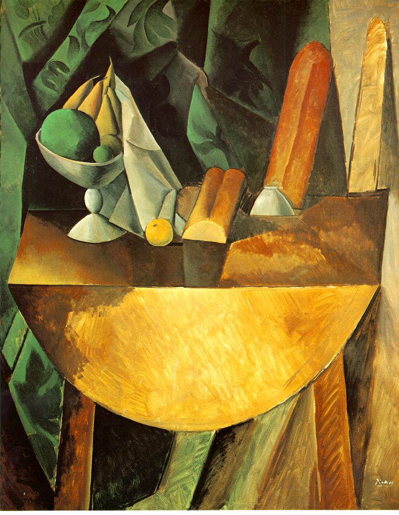
During this entry I will discuss a cubist painting and explain how it relates to our cubist drawings. The cubist painting I will discuss is known as 'Bread and fruit dish on a table'. It is one of the more known paintings of Picasso. Below is a picture of the paintings.

One of the aspects that change this painting from realistic paintings is the fact that it is painted from different angles. This can be seen in the picture as you can see multiple view points of the objects. Take the bananas for an example: there are multiple viewpoints present in the drawing. The contours are also very clear in the picture. This is both seen by differencing colours or a black line.

There are several aspects with this painting that can help me with future cubism drawings. One of the aspects that I can learn from is contours. This is because the picture has very clear contours and it can help me to find out what the major contours are.

Another aspect that can help me is the use of colour. This is because the painting really shows how colours can be used in Cubism or more specifically analytical cubism. It also shows how different viewpoint can be incorporated into a picture.

Cubism 27/10/11

During last lesson we continued our cubism unit. We started the lesson by watching parts of a film on Picasso. It was very usefull as we learnt allot on the method of cubism and we saw many different cubist paintings. When this was done we drew a painting when we drew with different angles. It was an analytic cubist drawing. During the painting we focused on the contours. With the drawing I am overall happy, but I believe the objects are not to well placed. It was very difficult.

This was the picture I drew. It was the most difficult drawing so far.

torsdag 20. oktober 2011

Cubism 20/10/11

Today we started a new unit about cubism. The first thing we did during this lesson was to discuss a few words that would be important to the cubism unit. This included "abstract (to remove), contour (edge) and still life (non-moving objects). We also had to draw a set of object and do several 'cubist activities' with it. This included us doing quick sketches with a lot of focus on the contour. We also did a sketch without looking at the drawing and ones where you had to change seat and continue your drawing from another perspective. The results were changeable. Overall I think I am going to apreciate this unit, even though I think it is going to be much harder than the previous unit.


Here is a picture of two drawings where we had to change our wiev of the picture.
I believe that the picture to the right is the most succsesfull.

torsdag 29. september 2011

29/9/11 Evaluation on Icon Unit

I think that this unit was a success and I really like the roughness of my drawing as I think it shows the character of the Icon. I asked other people in the class as well what they thought of it and they also liked the roughness of the drawing. They thought that I had really bothered a lot about the shading. This makes the picture look more realistic. Andreas and Sophie really said that this was one of the aspects that were good with the picture.

When this is said there are some aspects that aren't as good. Martha thought the tie and the background weren't dark enough. This is true even if I did it specifically in that way to make Obama stand more out. This is certainly the case with the background. The tie is actually dots of black and white and as I wanted the tie only to be one color, I decided to draw it gray. Martha was the one that didn't think the same way about the color of the background. She said it would be better with darker as it would make it more realistic. I thought the opposite.

For next time there are several aspects that I would change. Firstly I would try to be more careful with my ear and my lips. This is because I think the shading of the lips isn't completely correct. I would probably also do a more symbolic background as the light gray doesn't show too much. I should also shade the picture a little more smoothly. I agree with Sofie on this point. She also thought the ears could have some improvements. I also agree on this point. Except for this most people thought it was very good and successful.

 Here is the final picture with the final adjustments.

fredag 23. september 2011

Icons 22/9/11

Today we had our last day in this unit and I finished what I set out to do during the previous lesson. I did almost only shading during the whole lesson. I am really happy about how the picture has come out and I think it is good. I also asked what various people thought of my drawing and they all said that it looked good, even though some people  thought the picture was drawn a little too rough while they also thought the ears didn't fit into the picture. With the first point I do not agree as i think it gives it more style. The second aspect about the ear I completely agree as I think it was the aspect that was the worst in the whole picture!

Overall I think it was a good unit and I think my drawing was successful. The shading was one of the major reasons why this ended so well!

Here is almost my final picture. I have done some more detailed on the underlips. I think the shading was very good, even if it is a little too dark under the lips.

torsdag 15. september 2011

Icons 15-9-11

Today I continued drawing the picture. Finished the darker areas and started doing the shading of gray. It is looking good, even if therre is still allot of work to be done. I am happy with the shading so far, but I will have to be carefull not to mess the things up and put the good grey to the particular areas of the face. For next lesson i will have to continue with my shading and do the eyes of Barack Obama.
 
PS: I am not happy with the area under the nose!

torsdag 8. september 2011

Icons 8/9/11

Today we had our art lesson, and I continued to work on my picture of Barack Obama. I re-drew my mouth as well as starting to shade the whole object. I think the drawing is going on well, even if I am quite scared that the shading will not be succsesfull. When this is said i believe the shading of he hair and the clothes are looking good so far. I have a good feeling about the picture!

This is the picture that I had done in the previous lesson. This is what I had done from scratch during the first double lesson. I realy like the eyebrows and I think the outline is correct. The mouth is not good. The lips are wrong.


When we had finished the last double lesson, I done allot of the darker areas and re-done the mouth completely. It looks muck better now even if some adjustment with the teeth are needed. Most of the dark areas are needed and the whole outline is finished now. Next lesson I will have to start doing the shading.
Going good!

søndag 28. august 2011

Icons 28-8-11

Hello blogg
Today I am going to do my first entry to the the blog. During this first entry i will just talk about what we are doing during this unit and my feelings towards it.

This is the picture I will use as my picture of an Icon
During this unit our goal is to draw the face of an icon in black and white. When i forst saw this i thought that it was going to be imposible. First Mr. Roman explained the grid method and how we could use it to draw a face. I realy think this is going to help me. As my icon I chose Barack Obama.I hope and believe that my picture will be succsesfull. I have already started and it doesn't look too bad so far. The picture I am going to use is found on the interent site: https://blogger.googleusercontent.com/img/b/R29vZ2xl/AVvXsEhSwwLIxkm4HPe4fO7b63OKRyz0NXSUG56m2NDQtObOS9wp5yaG6Des2_OJrP60glzVe3wgGl8_y6nbr6-tFqWefJNtF3H5kU8CIx-GkPummY-C3k8yqCZ5ZnVwpBN9ZRlJnJpeVUUdNLE/s1600/barack+obama+bnw.png. You can also find it in goolgle if you search Barack Obama. The picture is the one on the side. It is a famous picture and i have seen it many times before we started this unit. To wrap up this first entry I will say that I think this will be a unit that will enhance my art skills. I believe this will be a good unit.